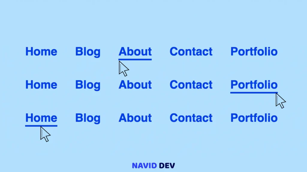
Hey guys, welcome to Navid Dev. In today’s topic, we’re gonna learn how to create an underline hover effect on anchor link tags and make a cool underline hover effect animation from left to right and also from right to left, and at last from center to the corners.
So, if you wanna learn something new today, stay tuned and watch the whole video down below and try to do it yourself, do not copy and paste the codes 🙂 ok? try to write the whole code by yourself, in this way you will learn, otherwise, you’re not gonna learn it.
Draw Underline Link Hover Effect with CSS
HTML Codes
<!DOCTYPE html>
<!-- Code by Navid Dev - Naviddev.com -->
<html lang="en">
  <head>
    <meta charset="UTF-8" />
    <meta http-equiv="X-UA-Compatible" content="IE=edge" />
    <meta name="viewport" content="width=device-width, initial-scale=1.0" />
    <title>Underline Link Hover Effect</title>
    <link rel="stylesheet" href="style.css" />
  </head>
  <body>
    <nav class="navbar left">
      <ul>
        <li><a href="#">home</a></li>
        <li><a href="#">blog</a></li>
        <li><a href="#">about</a></li>
        <li><a href="#">contact</a></li>
        <li><a href="#">portfolio</a></li>
      </ul>
    </nav>
    <nav class="navbar right">
      <ul>
        <li><a href="#">home</a></li>
        <li><a href="#">blog</a></li>
        <li><a href="#">about</a></li>
        <li><a href="#">contact</a></li>
        <li><a href="#">portfolio</a></li>
      </ul>
    </nav>
    <nav class="navbar scale">
      <ul>
        <li><a href="#">home</a></li>
        <li><a href="#">blog</a></li>
        <li><a href="#">about</a></li>
        <li><a href="#">contact</a></li>
        <li><a href="#">portfolio</a></li>
      </ul>
    </nav>
  </body>
</html>
CSS Codes
* {
  padding: 0;
  margin: 0;
  box-sizing: border-box;
}

a {
  text-decoration: none;
  color: #003cf1;
  font-weight: bold;
  display: block;
}
body {
  min-height: 100vh;
  display: grid;
  place-content: center;
  background: #b9e2ff;
  font-family: sans-serif;
}
.navbar ul {
  margin-bottom: 2rem;
}
.navbar ul {
  display: flex;
  list-style: none;
}
.navbar ul li {
  margin: 0 1rem;
}
.navbar ul li a {
  font-size: 1.3rem;
  text-transform: capitalize;
  position: relative;
  overflow: hidden;
  padding-bottom: 4px;
}
.navbar ul li a::before {
  content: "";
  position: absolute;
  left: 0;
  bottom: 0;
  width: 100%;
  height: 3px;
  background-color: #003cf1;
  transition: all 0.3s ease-in-out;
}

.left ul li a::before {
  left: -100%;
}
.left ul li:hover a::before {
  left: 0;
}

.right ul li a::before {
  right: -100%;
  left: auto;
}
.right ul li:hover a::before {
  right: 0;
}

.scale ul li a::before {
  transform: scale(0);
}
.scale ul li:hover a::before {
  transform: scale(1);
}