Creating a responsive nav menu is always challenging and it takes some time to be good at developing a great navigation menu that is also responsive. Therefore in today’s subject, we are going to see how can we build a responsive top navigation menu bar. So stay tuned and let’s dive into coding 🙂
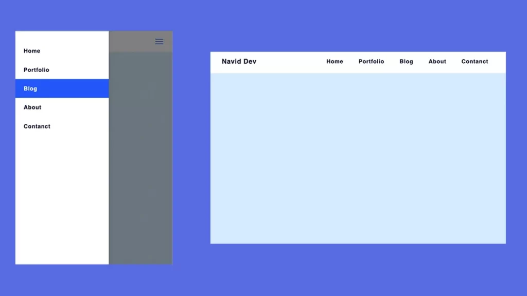
Responsive Top Navigation Menu
In order to create a responsive navigation menu, you should know that there are so many ways to build it, Although I’m gonna show the best practice which you can use almost in every future project that you might have, Alright enough talking let’s build it.
HTML Code
Here you can find the HTML code which I used to create this amazing and responsive nav menu.
<!DOCTYPE html>
<html lang="en">
  <head>
    <meta charset="UTF-8" />
    <meta http-equiv="X-UA-Compatible" content="IE=edge" />
    <meta name="viewport" content="width=device-width, initial-scale=1.0" />
    <title>Navid Dev - Responsive Nav Menu</title>
    <link rel="stylesheet" href="style.css" />
  </head>
  <body>
    <header>
      <div class="header container">
        <a href="/" class="logo">Navid Dev</a>
        <nav class="navbar">
          <ul>
            <li><a href="#">Home</a></li>
            <li><a href="#">Portfolio</a></li>
            <li><a href="#">Blog</a></li>
            <li><a href="#">About</a></li>
            <li><a href="#">Contanct</a></li>
          </ul>
        </nav>
        <div class="menu">
          <svg
            xmlns="http://www.w3.org/2000/svg"
            fill="none"
            viewBox="0 0 24 24"
            stroke-width="1.5"
            stroke="currentColor"
            class="w-6 h-6"
          >
            <path
              stroke-linecap="round"
              stroke-linejoin="round"
              d="M3.75 6.75h16.5M3.75 12h16.5m-16.5 5.25h16.5"
            />
          </svg>
        </div>
        <div class="dark-part"></div>
      </div>
    </header>
    <script src="script.js"></script>
  </body>
</html>
CSS Code
Here you can find the CSS code which I used to create this amazing and responsive nav menu.
* {
  padding: 0;
  margin: 0;
  box-sizing: border-box;
}
:root {
  --primary-color: rgb(44, 89, 255);
  --secondery-color: rgb(4, 16, 61);
}
body {
  font-family: sans-serif;
  background: rgb(218, 237, 255);
}
a {
  text-decoration: none;
  color: var(--secondery-color);
}
ul {
  list-style: none;
}
.container {
  max-width: 90%;
  margin: auto;
}
header {
  background: #fff;
}
.header {
  display: flex;
  align-items: center;
  justify-content: space-between;
  padding: 1rem 0;
}
.logo {
  color: var(--secondery-color);
  font-weight: bold;
  letter-spacing: 1px;
  font-size: 1.3rem;
}
.menu {
  cursor: pointer;
  width: 33px;
  height: 33px;
  color: var(--primary-color);
}
.navbar ul {
  background: #fff;
  box-shadow: 0 0 15px 5px rgba(0, 0, 0, 0.08);
  position: fixed;
  bottom: 0;
  top: 0;
  left: 0;
  padding: 2rem 0;
  min-width: 300px;
  transform: translateX(-100%);
  transition: transform 0.3s ease-in-out;
  z-index: 2;
}
.navbar ul li a {
  padding: 1.2rem 2rem;
  font-size: 1.1rem;
  letter-spacing: 1px;
  display: block;
  font-weight: bold;
  transition: all 0.2s ease-in-out;
}
.navbar ul li:hover a {
  background: var(--primary-color);
  color: #fff;
}
.header.active .navbar ul {
  transform: translate(0);
}
.dark-part {
  position: fixed;
  inset: 0;
  background: rgba(0, 0, 0, 0.5);
  z-index: 1;
  opacity: 0;
  pointer-events: none;
  transition: opacity 0.2s ease-in;
}
.header.active .dark-part {
  opacity: 1;
  pointer-events: auto;
}

@media screen and (min-width: 768px) {
  .menu {
    display: none;
  }
  .navbar ul {
    box-shadow: none;
    position: static;
    min-width: auto;
    padding: 0;
    display: flex;
    transform: translate(0);
  }
  .navbar ul li a {
    padding: 0.7rem 1.5rem;
  }
  .dark-part {
    display: none;
  }
}
JAVASCRIPT Code
Here you can find the JAVASCRIPT code which I used to create this amazing and responsive nav menu.
const triggerMenu = document.querySelector(".menu"),
  header = document.querySelector(".header"),
  close = document.querySelector(".dark-part");

triggerMenu.addEventListener("click", () => {
  header.classList.add("active");
});
close.addEventListener("click", () => {
  header.classList.remove("active");
});
Summary
In today’s topic, you have learned how to create a responsive navigation menu with HTML, CSS, and javascript, I hope you guys enjoyed this tutorial, if you have any questions, feel free to drop a comment down below. Cheers 🙂